
.svg)


This sample is available as a template in dominKnow | ONE.
Sign up for a free trial to check it out!
There are other subtle visual hints used to help encourage the learner to scroll down through this elearning infographic, too. In the hero section at the top, there’s a small down-arrow image, which becomes a theme below the section titles through the rest of the page. And each section title uses a downward-angled decorative element as a background, to help guide the learner down through the content.
If you check out this elearning infographic on multiple screen widths and even on different devices, you’ll see that the overall scrolling experience remains consistent but the content adjusts its shape subtly, particularly the text boxes for each section. No matter what device or screen size you are using to view the elearning infographic, the Flow-based content makes sure that you have a great experience. In fact, you probably won’t notice a difference unless you know to watch for it.
And something to note – this elearning infographic took only a couple of hours to create in Flow, taking advantage of Flow’s collection of pre-made content sections.
An elearning Infographic like this one can stand on its own or be part of a larger learning experience or elearning course. And of course, it can be published to SCORM or xAPI if you need to have tracking in place for completion. You could even add a scored test to it.
You can find all of the details about how it was created in this blog post here.
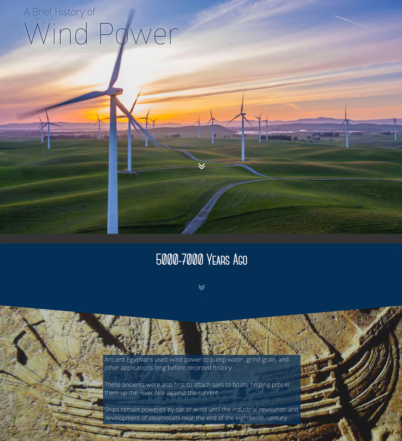
Big thanks to Tom Spiglanin and Palm Springs Windmill Tours for agreeing to share this content with us.
For more details on how this infographic was created, check out the full blog article we’ve posted for this example.